Innovation in design gets talked about like it is some magic switch. Turn it on, get a better product, nicer branding, cleaner screens, smarter packaging, happier users. Real life is not that tidy. Innovation in design usually starts with a mess. A rough sketch. A question nobody has answered well yet. A layout that almost works but not quite. That is exactly why this topic matters.

At its best, innovation in design is not about chasing novelty for the sake of it. It is about making useful things clearer, stronger, and easier to experience. Sometimes that means improving a website so people stop getting lost. Sometimes it means fixing the color balance on a product label. Sometimes it means testing a prototype before you waste time polishing the wrong idea. The work changes, but the goal stays the same. Make something people can understand and use.

That is the role Innovation in Design should own. Not another design site full of vague inspiration and pretty screenshots with no practical value. There is already plenty of that online, and honestly, a lot of it starts to blur together. This site should feel more grounded. It should help readers think better, notice more, and make smarter creative decisions without pretending every project needs a TED Talk.

Why innovation in design still matters

Good design affects how people move, choose, trust, remember, and buy. It shapes first impressions, but it also shapes outcomes. A confusing menu, weak hierarchy, clumsy prototype, or muddy color system can quietly wreck an otherwise good idea. On the other hand, small design improvements can make a product feel easier, a brand feel sharper, and a message feel more believable.

That is why innovation in design still matters. Not because every project needs to look futuristic, but because every project benefits from better thinking. Readers come to a site like this because they want practical help. They want to understand what makes a design work, where it falls apart, and how to improve it before the mistakes get expensive.

This homepage should make that promise clear. Innovation in Design is here for designers, makers, founders, marketers, students, and curious people who care about how ideas become real things. The focus is not just aesthetics. It is process, clarity, testing, communication, and useful creative judgment.

Innovation in design starts with people

I believe the best design advice begins with a simple truth: people do not experience your work the way you do. They do not know what the wireframe looked like last week. They do not know which font took two hours to choose. They do not care how clever the concept board felt in the meeting. They only know what is in front of them.

That matters because design fails when it becomes too self-impressed. A homepage can look clean and still confuse visitors. A package can look premium and still hide the important information. A prototype can feel exciting inside the team and still make no sense when a real person touches it.

So the site’s voice should reflect a human-centered mindset. Write for the reader who is trying to solve a problem, not impress a committee. Keep the tone smart, but not stiff. Curious, but not academic. Helpful, but not pushy. Readers should feel like they are getting ideas they can actually apply this week, not just admire for ten seconds and forget.

Design tools, workflows, and prototypes that earn their keep

A strong design site should not live in theory alone. Ideas are useful, but process is what gets work done. That means Innovation in Design should speak clearly about the tools, habits, and workflows that help creative people move from concept to result.

Some readers need help choosing software. Some need better ways to organize feedback. Some need a reminder that rough prototypes are not a sign of weakness. They are how you catch bad assumptions early. And some just need permission to stop polishing version one like it is sacred. It is not sacred. It is version one.

That practical angle is already a good fit for the site’s direction. Pieces like Unlock Your Creativity with These Top Free Design Tools and The Color Wheel for Non-Designers point toward the kind of content that helps readers do better work, not just consume design as a mood board.

The homepage should lean into that. Tell readers they will find clear breakdowns of design tools, prototyping lessons, workflow ideas, and real creative tradeoffs. Not just what looks good, but what works, what fails, and why.

Clarity, color, hierarchy, and the small decisions that change everything

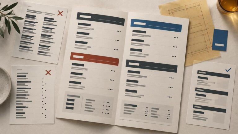
A lot of creative work comes down to decisions that seem small until they are not. A stronger headline. Better spacing. More readable contrast. A cleaner visual hierarchy. A smarter sequence of information. These are not glamorous fixes, but they are often the difference between friction and flow.

And that is another reason this site can be useful. Innovation in design is not only about big leaps. Sometimes it is about noticing the exact point where communication breaks down and fixing it with precision. That is a worthwhile lens for articles about branding, packaging, interface design, content structure, and physical product presentation.

This also gives the homepage a stronger identity. Innovation in Design is not just about ideas in the abstract. It is about how design decisions behave in the real world. What grabs attention. What guides the eye. What helps people understand something faster. What makes a concept feel intentional instead of random.

Readers do not always need more inspiration. Sometimes they need someone to say, this layout is too busy, this label is not readable, this flow asks too much too soon, this prototype is telling you something important. A good design publication earns trust by being willing to make those calls.

A place for digital design, physical design, and everything between

One of the better things about the Innovation in Design angle is that it does not need to stay boxed into one format. Design problems show up everywhere. In websites, packaging, illustrations, brand systems, product concepts, mockups, prototypes, cards, collectibles, and physical objects people hold in their hands. The medium changes. The thinking still matters.

That means the homepage can welcome a broader creative audience without sounding scattered. It can say, in plain language, that the site covers digital and physical design through the shared lens of clarity, experimentation, usability, and creative problem-solving.

A lot of readers work across categories now anyway. The same person might touch web pages, email graphics, product packaging, social posts, printed material, and a prototype in the same month. They do not need a site that treats those worlds like separate planets. They need one that helps connect the dots.

What readers should expect here

Innovation in Design should feel like a practical design publication built for people who want clear takeaways. Readers should expect:

  • design thinking that stays close to real work
  • useful breakdowns of tools, workflow, and process
  • smarter takes on prototyping and iteration
  • plain-English discussions of color, hierarchy, and layout
  • examples drawn from both digital and physical design
  • articles that respect the reader’s time

That last point matters more than people admit. Time is the real budget most creative people are protecting. So the homepage copy should promise clarity. No inflated language. No fake mystery. No dragging a simple idea through six dramatic paragraphs just to sound important.

Final thoughts

Innovation in design is not about being flashy. It is about being thoughtful enough to improve what people actually experience. That can mean a sharper interface, a better prototype, a more readable package, a smarter workflow, or a clearer visual system. Different project, same job. Make the idea work better.

So that is the tone this homepage should set. Calm. Practical. Curious. A little opinionated when needed. Built for readers who care about how design works, not just how it looks. If a visitor lands here and thinks, finally, somebody is talking about creative work like a real process, then the homepage is doing its job.